No products in the cart.
5 Tips to Get Cleaner, Crisper DTG Prints
Dane Clement outlines what to consider when using or creating raster images for DTG printing
Most people in the garment decoration industry gravitate to vector artwork, which is created using points and paths. The shapes created by these paths are usually filled with solid colors, and the number of colors is limited.
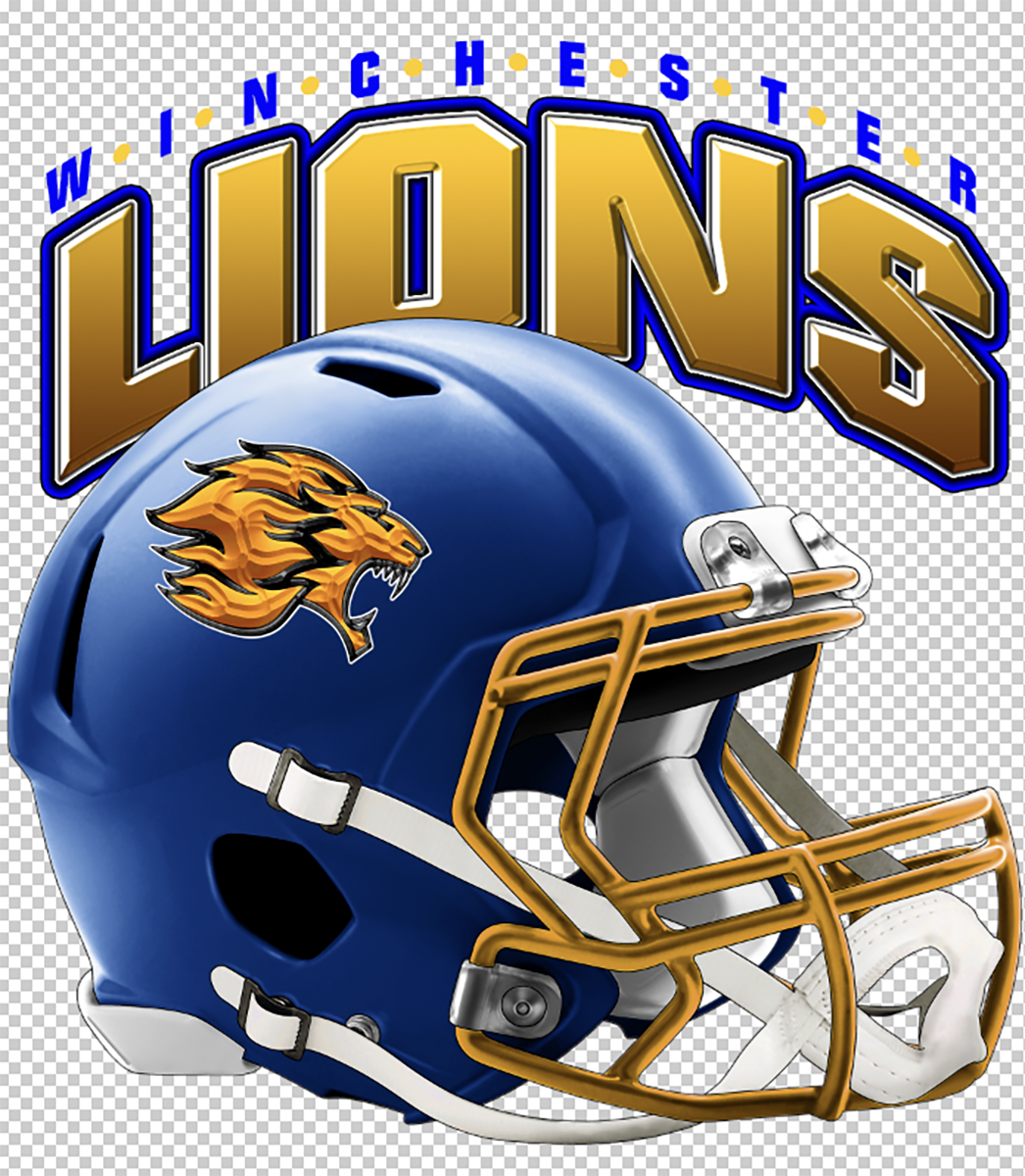
With digital printing options like direct-to-garment (DTG) printing, one of the most significant advantages is printing full color without any additional time or cost involved. For this reason, raster artwork, which is made up of pixels creating continuous tones, shades, and gradients, is a great option for this type of printing. Photographs and full-color illustrations are perfect examples of this type of art.
When using or creating raster images, what should you consider to ensure your final print is as good as possible? Here are five tips to help get you started.
Tip No. 1: Use the proper dimensions
Unlike vector artwork that can be resized infinitely without affecting the quality of the image, raster artwork will become blurry and pixelated if it is enlarged too much. For this reason, you should set up your image at the exact dimensions that you need.
If you will be printing the design on multiple products, set it up for the largest product first. You can then reduce it for smaller products without affecting the quality. For instance, if you are creating a full front for adult shirts and then want it smaller for youth shirts or totes, set it up for the adult-sized shirts first. Reduce it and save the smaller size layout for the additional applications.
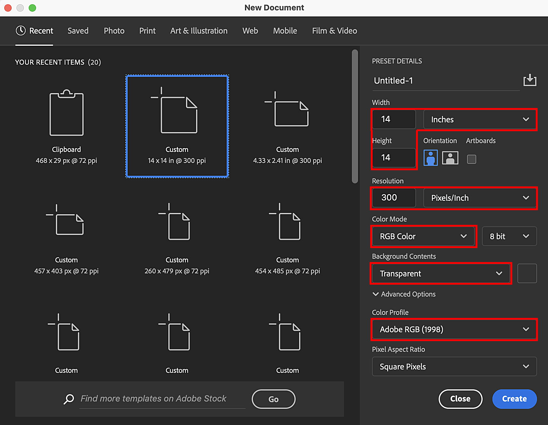
When I create an image, I set the document up at 14″ X 14″ and make the image as large as possible to fit within those dimensions. At these dimensions, you can reduce it for smaller applications, but it is also big enough for use with larger applications like banners. The document’s height can then be expanded to 16″ or so to add room for type to create a complete layout.
Tip No. 2: Don’t forget about high resolution
When it comes to resolution, I recommend 300 PPI. The higher the resolution, the larger the file size. You can go larger, but 300 is more than enough to give you sharp detail without making the file size too large to handle.
By using this resolution with the dimensions mentioned above, the image will have more than enough information to be used for larger applications. You can create your design for printing a full-front shirt design at these specifications and then adjust it as needed for the larger application.
For large-format printing, 150 PPI at actual size is a common recommendation by printers. By using the above-mentioned specs, when you change the resolution to 150 PPI, the dimensions will actually double. So if you start a design at 14″ X 14″ at 300 PPI, when the resolution is cut in half to 150, the dimensions can be doubled to 28″ X 28″ and keep the same quality. Making it large enough to use on a banner.
Tip No. 3: Start with a transparent background
When creating your artwork, it’s important to create it on a transparent background, especially when it comes to DTG. If the art is flattened on a colored background, the printer will print the background color as well. Even if you have a white background and you are printing on white shirts, or you have a black background and are printing on black shirts, the white or black background will print, creating a big solid rectangle on the garment.
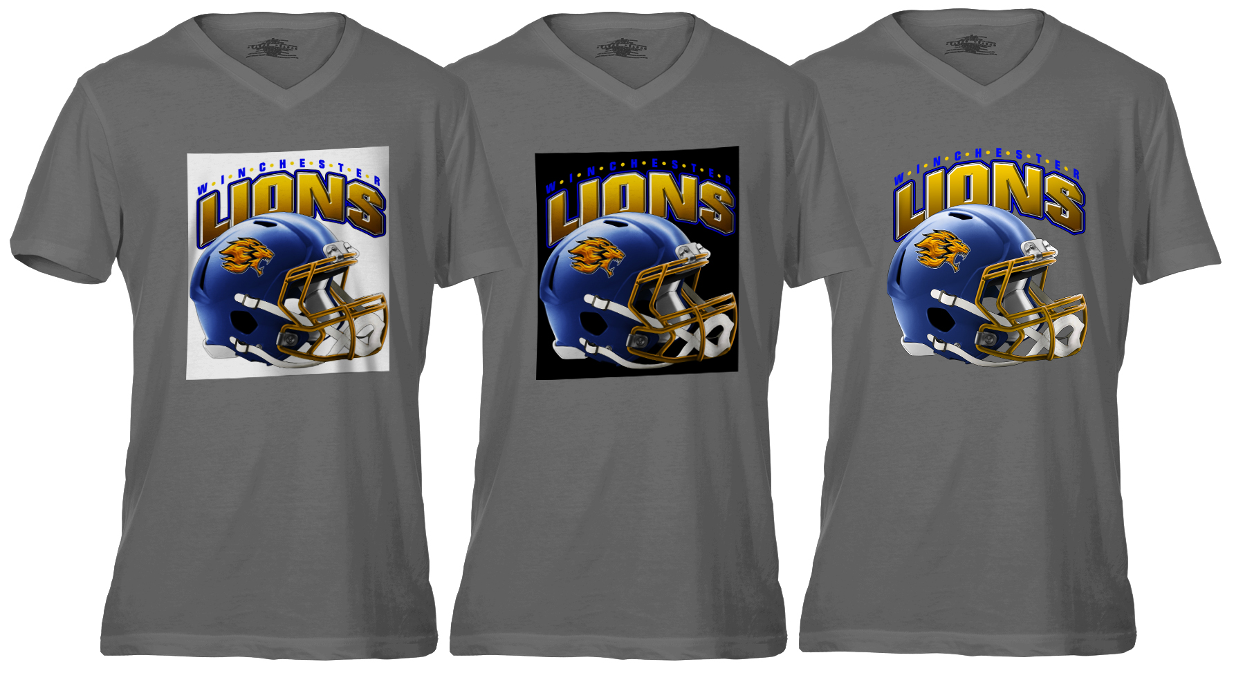
When you set up a new file, select the transparent background option. A gray and white checkered background will be visible when the document opens. This denotes the area is transparent. You can add a layer and fill it with a color that represents the shirt color you will be printing on to help you visualize how the image will look as you create it. However, before you go to print, save a separate file without the background color for printing.
There are ways to eliminate background colors if the artwork is flattened, but it can be time-consuming, and the quality of the image can be affected. So it’s always best when starting a new design to set it up with a transparent background.
Tip No. 4: Color profile matters
Even though digital printers like DTG printers use CMYK inks for printing, I recommend using the RGB color mode because it offers a larger color gamut than CMYK. When you go to print, there will be as much color information as possible going to the printer. When you start a new document, you should set the color mode to RGB and then set the color profile to Adobe RGB (1998). This profile allows for cleaner colors and richer blacks, so the overall color looks better when your image prints.
Tip No. 5: Avoid solid areas of color
One of the issues that can come up with DTG printing is banding. This is a series of lines or streaks that appear when a print head becomes clogged, preventing the ink from firing through the print head nozzle onto the shirt. The less ink goes onto the shirt, the more visible the banding. This is more evident in designs with large solid areas of color. If, for instance, the area in question is blue and the cyan print head is clogged, preventing the ink from firing, the banding will be very obvious.
This is another reason why I don’t recommend using vector artwork. Vector artwork usually consists of large solid areas of color, making it more prone to banding. Since raster artwork is made up of various continuous tones of colors, banding can be camouflaged. If one color cannot print, banding can be camouflaged by other colors printing in the same area. Applying textures, gradients, and patterns to solid areas will help to break them up and camouflage banding should it occur.
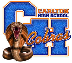 |
Vector artwork usually consists of large solid areas of color, making it more prone to banding. (Images courtesy Dane Clement) |
Making sure you set up your art correctly from the beginning will go a long way to ensure your final print is the best it can be. By applying these tips as you get started, you’ll be on your way to printing products that will create happy, repeat customers!

Leave a Reply
You must be logged in to post a comment.