No products in the cart.

Artwork Tips for DTG Users
Bad art leading to bad prints won’t keep the customers coming back for more
Over recent years direct-to-garment (DTG) printing has fast become a popular production method for garment decoration. With benefits like full-color printing, the capability to print white ink for dark shirts, and the ability to print small quantities at cost-effective prices, it’s no wonder why. These benefits allow you to print full-color graphics such as photos and illustrations, and create individual personalized layouts.
But even with all these benefits, you still need to create artwork that’s setup properly to get the best print possible. Bad art leading to bad prints won’t keep the customers coming back for more.
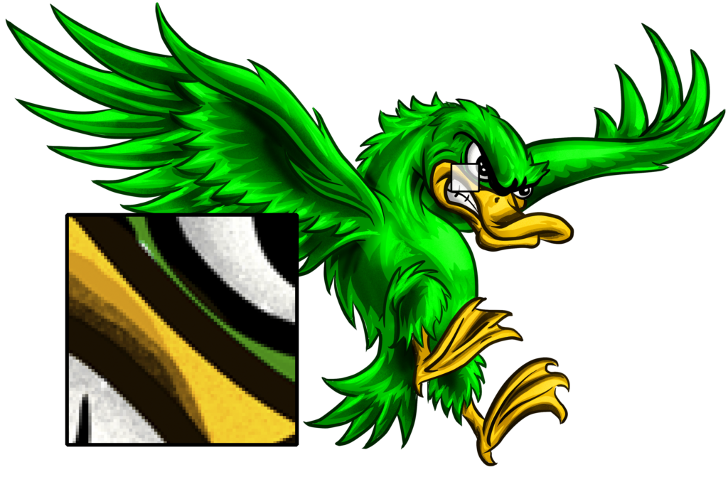
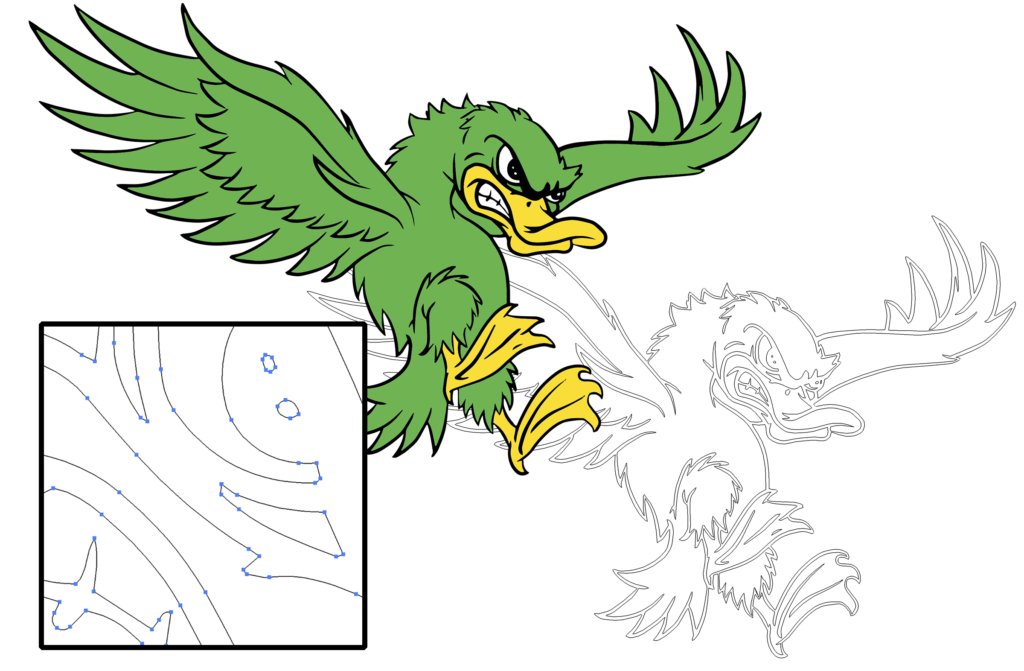
While many people in this industry are more familiar and comfortable with vector art, raster artwork allows you to reap the benefits of full-color printing capabilities. Raster images are made up of a continuous tone of pixels (Fig. 2), unlike vector art, which is made up of points and paths (Fig. 3) that you can enlarge without affecting the overall quality of the image.
|
Fig. 2 |
Fig. 3 |
Because of this, raster images should not be significantly enlarged without losing image quality. When creating a raster image, you want to make sure it is set up at the proper size and resolution from the beginning. Typically, you want the size to be set up at the dimensions you plan to print. If you will be doing the same image at various sizes, it’s best to set it up at the largest size and then reduce it for the smaller prints. I recommend a final image size of approximately 12″ wide X 15″ high for full-size images. When it comes to the resolution, 300 PPI is recommended to produce sharp, clean prints.
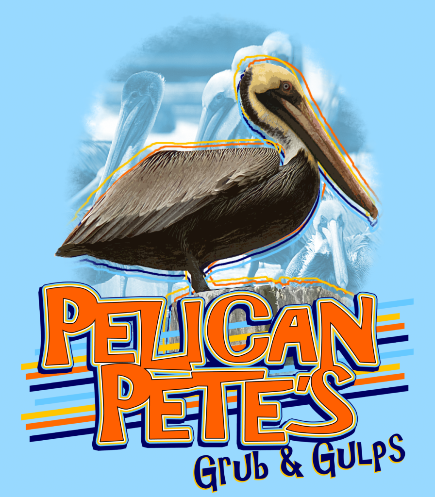
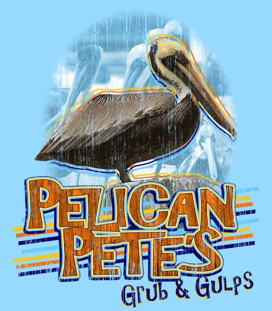
Another reason for using raster artwork is that vector artwork is usually made up of large flat areas of color. This isn’t recommended due to an issue known as banding. Banding is the pattern of lines or streaks that occur in a print when print heads become clogged. Digital prints are created as the various ink colors are fired through a small opening or nozzle of the print head. If the ink cannot fire or misfires, there is no color going onto the substrate resulting in banding lines or streaking in your design. With raster artwork, you generally won’t have large solid areas. Photographs, for instance, will have a continuous range of color throughout the image, which uses multiple ink colors to reproduce. If one color becomes clogged, the other colors that print will fill in the area camouflaging the banding and making it less visible. Adding effects like gradients and textures in solid areas will help create a continuous tone to aid in camouflaging should banding occur. (See Fig. 4 and 5)

Fig. 4 |

Fig. 5 |
When you have a printer that lets you print full color, you need to take advantage of that and create artwork that allows you to use your printer to its fullest potential. Sure, you can use vector art and apply multiple colors, even gradients, but introducing photos and painted illustrations into your art library broadens what you can offer your clients and sets you apart from your competition.


Leave a Reply
You must be logged in to post a comment.