No products in the cart.
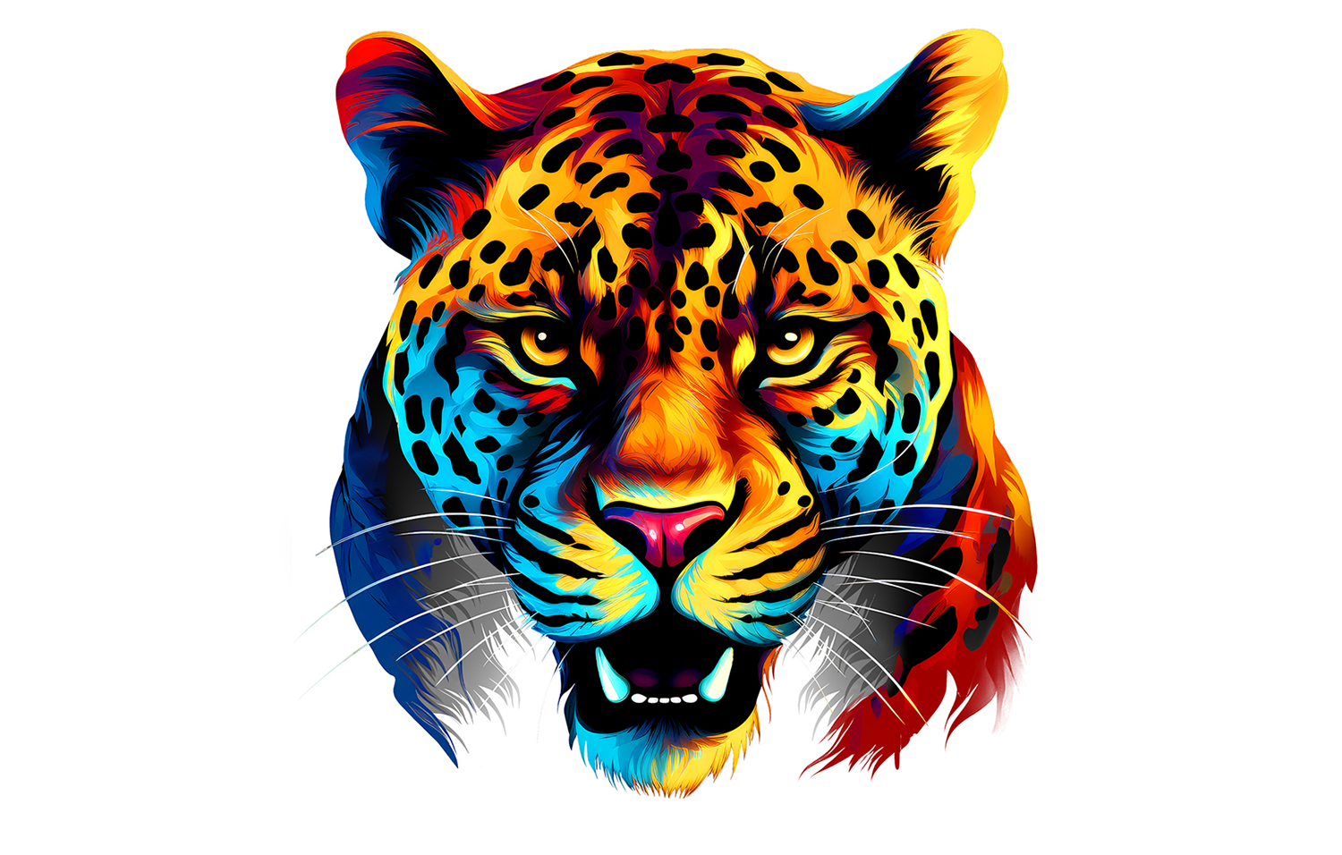
Cost-Effective Designs for Screen Printing Using Full-Color Raster Images
Source: https://www.apparelist.com/
When it comes to creating designs for screen printing, the number of colors used greatly affects the cost of the print. The greater the quantity of shirts to be printed, the more cost effective it is to print designs with more colors. However, the time it takes to expose screens and set them up on a press does not make it beneficial to print a full-color design for short runs. Generally, in these cases, simple one- or two-color vector clip art and/or text is used to create a basic layout.
But just because you may be restricted to one to three colors for a design doesn’t mean your artwork has to be basic. Think outside the box and utilize full-color, raster images to your advantage. Work with images in Photoshop to transform them into fewer colors that still make an impact.
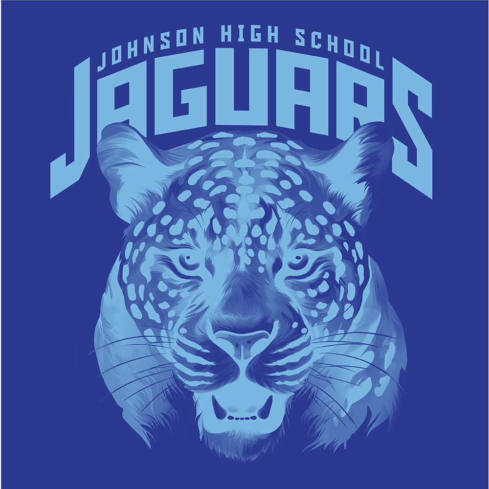
In the design world today, AI is being utilized more and more to generate images and layouts for garment decoration. While you can provide prompts to generate images in certain colors, you don’t always get what you want. In general, AI images are created in full color (see image at the top of this article). When it comes to digital printing methods like direct-to-film (DTF), direct-to-garment (DTG), or dye-sublimation, this isn’t an issue because it doesn’t affect the price.
So, how can screen printers benefit from AI or any full-color images they may have to create on a budget using less colors?
Grayscale Image
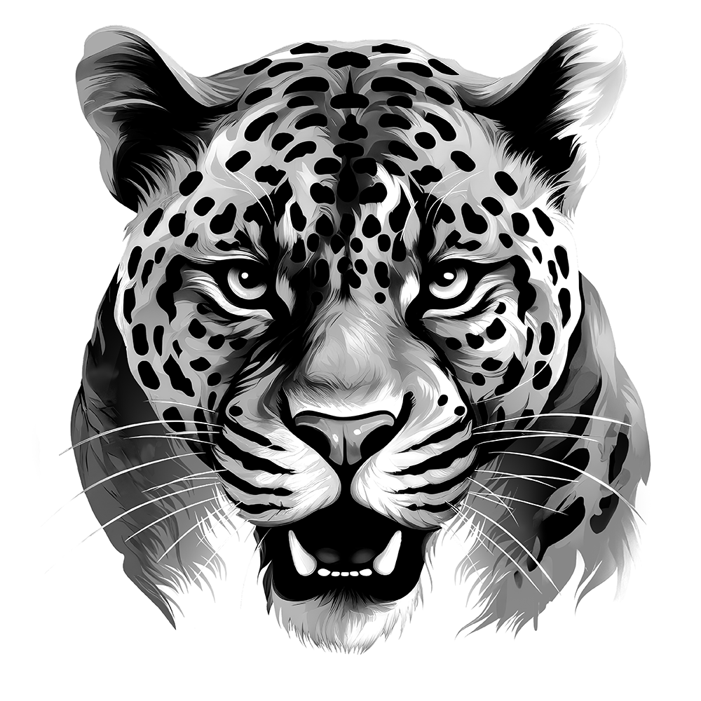
One of the most basic ways is to turn the image into a grayscale. You can simply change the mode of an image from RGB or CMYK to grayscale and it is now a one-color design. Even though the color may be gone, you are still left with a detailed, impactful image. This makes for a great tone-on-tone design when the ink color used is in the same color family as the shirt color.
Depending on the design and the original colors, just changing it to grayscale may not be enough. You may need to adjust the levels or curves to adjust the lightness or darkness of the design to get good contrast (Images 2 and 3).
Image 2
Image 3
Make sure the black areas or darkest areas of the image are at 100%, whites are at 0%, and that there is good variation between grays in between. While everyone’s equipment is different, a general rule of thumb to keep in mind is that most halftones above 80% will become solid, and anything below 10% will not be held on the screen and, therefore, will not print well.
So, as you are adjusting the percentages, anything that you want to print without becoming solid or falling off should fall between 10% – 80% with good distinction between the varying shades. If not, and there isn’t good contrast between the shades of gray, dot gain will cause the image to fill in and lose detail and definition.
When you initially transform the image to grayscale, the white areas do not become transparent. To do that, make a selection of the grayscale alpha channel, make a new layer, and then fill the selection with black. Delete the original grayscale layer, and your image is ready for use.
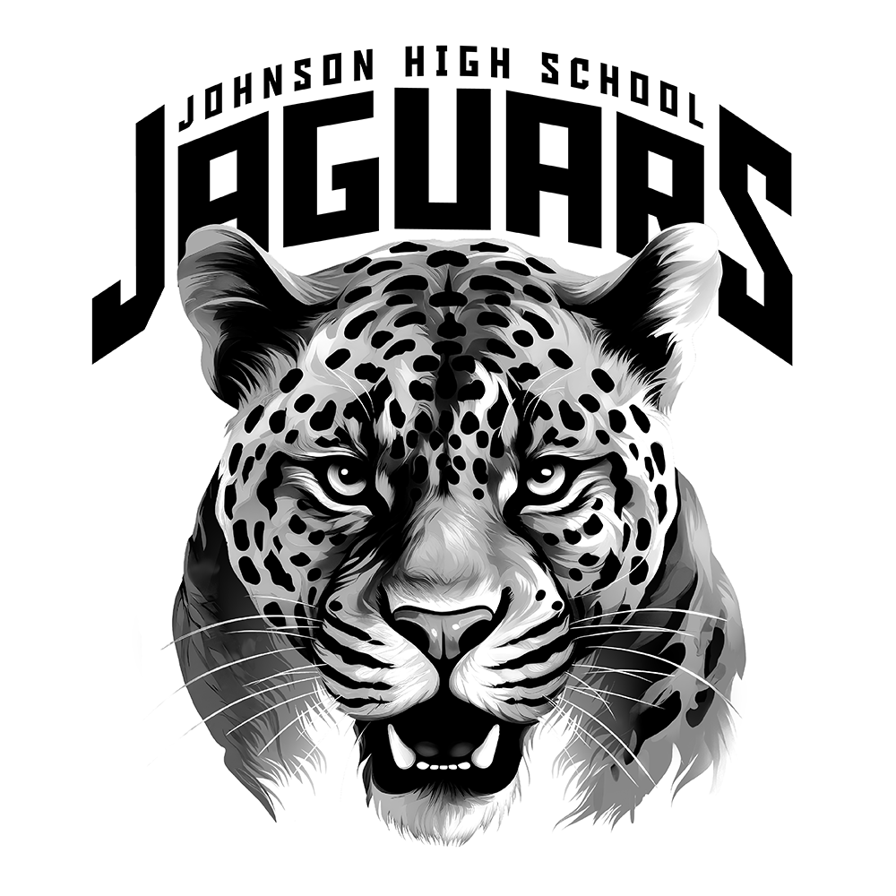
The grayscale image can remain black to print out the positive to expose your screen. You can add your type in the Photoshop file, or you can save the image itself as a PNG file with a transparent background and import or place it into a vector program like Illustrator to add your type and print your film positive from there (Image 4).
Image 4
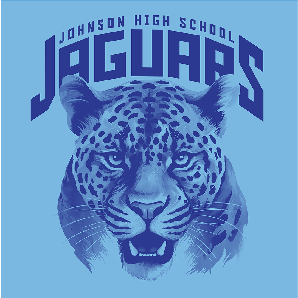
If you need to show a proof to your customer, you can place the PNG in Illustrator and color it with the appropriate spot color, and put a background color behind it to represent the shirt color (Image 5). Make sure the color you use is set up as a spot color or it will not work. The image will remain black.
This grayscale method works when the image will be printed in a color darker than the shirt. There may be instances depending on the design where a lighter color print will work on a darker shirt, but usually it will look like a negative image on the shirt (Image 6).
Image 5
Image 6
Grayscale with a Twist
Another unique look utilizes the grayscale option, but incorporates a large halftone screen for a more graphic look (Image 7).
While you could print it as a one-color as mentioned above, you can also add some additional spot colors for added punch. By saving the grayscale image as a PNG, you can import it into Illustrator and color it with a spot color. You can then use the pen tool to create a shape in the area where you want to apply the additional color and place it behind the grayscale image. Since the grayscale is transparent, the added area of color will show through, and the shirt color will show through everywhere else (Image 8).
Image 7
Image 8
Hue/Saturation Colorize
Another option you can use to take a detailed, full-color image and reduce it down to two to three colors is using the Colorize option in the Hue/Saturation Adjustment (Images 9 and 10).
Image 9
Image 10
Once the color is set, you will need to make adjustments to the darkness and lightness of the image using the levels or curves like you would with the grayscale option (Image 11). The interior of the image is not open, so the shirt color will not show through. The image will still maintain any black and white areas while transforming all other colors into varying shades of the selected color. This is a good option to use when going on a darker colored shirt (Image 12).
Image 11
Image 12
With this option, you will need to generate your separations like you would for a full-color image, but the separated information should be limited to black, white, and the main color. If you are only printing on black or white shirts, then the design can be printed in two colors. If you are printing on a colored shirt, you would need to print three.
Use Existing Separations from a Full-Color Image
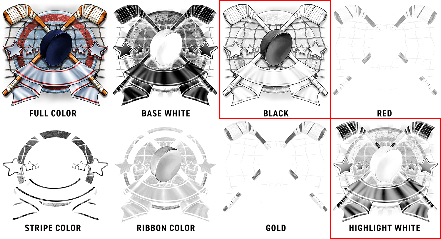
If you’ve printed an image already for a full-color design using simulated process separations, but are looking for an inexpensive option to reprint some additional products for the same customer, start by reviewing your existing full-color separations. You may find that you can create a one- to three-color design just by selecting certain separations. You can use the black or the base white, for instance, to create a one-color design. Throw in another color from the separations to create a two- to three-color design.
The example shown here was originally separated with Separation Studio into seven colors, but the black and highlight white separations were used to print the same image in just two colors using dark blue and white inks (Images 13 and 14). Since you won’t be printing all the colors, the shirt color will show through in the areas where the other colors would normally print. It’s important to keep this in mind when thinking about the final look you want to achieve.
Image 13
Image 14
These are just a few ideas for screen printing images on a budget without having to sacrifice design. Your customers may be used to simple clip art layouts when they know they can only get a one- to two-color print, but why not show them something different. Whether you use something from a stock art library you already have, or utilize AI to generate an image, you’ll be able to provide a more detailed, interesting image at no additional cost.
Cost-Effective Designs for Screen Printing Using Full-Color Raster Images






Leave a Reply
You must be logged in to post a comment.